
To get started customizing your template, it is recommended to begin with the Tricefy global template that best fits your needs. Changes to your template are automatically saved.
The template editor should not be used with tablets and mobile devices.
Removing & Duplicating Fields
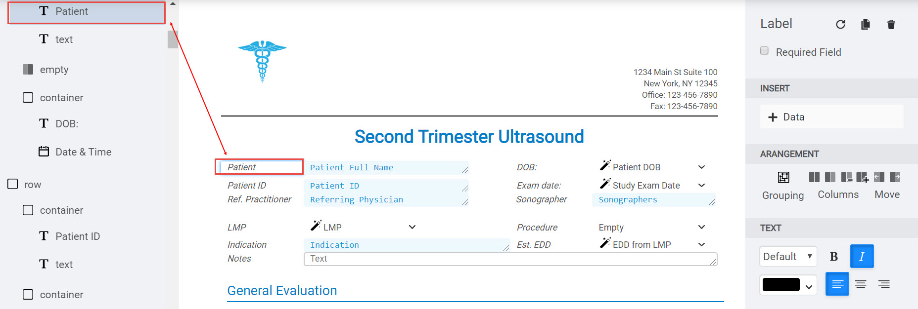
All the items located on a template are populated on the left sidebar. Selecting an item on your template will highlight the corresponding item on the sidebar, making it easy to locate:
Hovering your mouse over an option on the left sidebar will display two small icons (the item does not need to be selected):
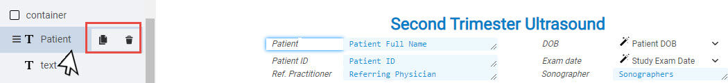
- Click the trashcan icon to remove this item from the template.
- Click the
 icon to duplicate the item on the template.
Hovering your mouse over an option on the left sidebar will also display three lines - clicking these three lines will allow you to move that item to a new location on the template.
 Learn how to move fields and organize your template
Adding new Fields
To add a new form field to your template:
1) Hover your mouse where you want the new field to appear
2) Select the + button to add a new item
3) Choose Forms from the menu, followed by one of the following:
Label: Labels are the text that explain what content belongs in the field. In the example below, "Patient" and "DOB" (shown in the red boxes) are labels:

Text: Inserts a label and a text box (for entering alphanumeric characters)
Number: Inserts a label and a number field (for entering only numbers)
Checkbox: Inserts a label with a single checkbox:
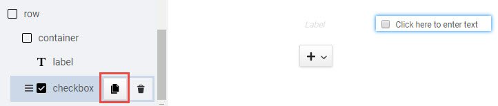
- Click in the empty text box to enter text
- To create additional options, hover your mouse over the checkbox item in the left sidebar and select the Duplicate icon (shown above in the red box)
- Repeat steps 1-2 until you have created all your text boxes
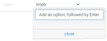
Dropdown: Inserts a label with a drop-down menu for choosing a specific option:
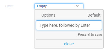
- Click in the field that says "Empty"
- Type an option, followed by Enter your keyboard
- Continue typing options
- If applicable, select one of the options as the default
- Click Close
Multi-select: Inserts a label with a drop-down menu for choosing multiple items
- Click in the field that says "Empty"
- Type an option, followed by Enter your keyboard
- Continue typing options
- If applicable, select which items will be selected by default
- Click Close
Radio Buttons: Inserts a label with a series of radio buttons
- Click in the empty text box add an option, followed by Enter on your keyboard
- Continue adding options
- Click Close
Snip: Inserts a label with a text box to use with smart text (frequently-used text that is saved)
Gestational Age: Inserts a label with a field for inserting a gestational age
- When a user selects this field, a window will display for entering a number of weeks and days
Date: Inserts a label with a field for inserting a date
- When a user selects this field, a calendar will display for specifying a date (and option to also set a time)
Time: Inserts a label with a field for inserting a time
Image Placeholder: Inserts a label with a placeholder for inserting an image into a report
Learn more about Image Placeholders
Required Fields
To make a field required, check the Required Field box at the top of the right sidebar. Required fields must contain data in order for a report to be finalized.
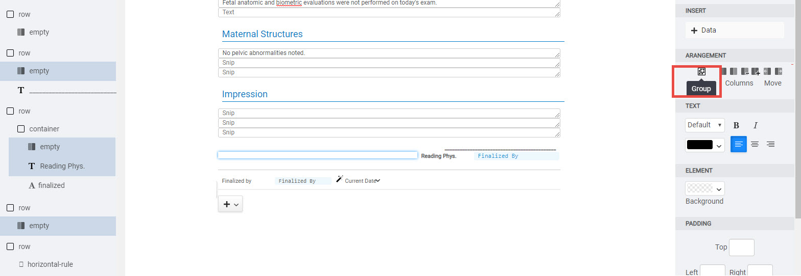
Grouping and Containers
Labels and their corresponding fields (text boxes, checkboxes, radio buttons, drop-down menus, etc.) are automatically grouped together into a "container." You can manually group items by holding down the shift key (or command key) on your keyboard while selecting items on the left sidebar. Once your items are selected, click Group under the Arrangement Settings:
 Copyright © 2016-2018 Trice Imaging, Inc. All rights reserved. 1343 Stratford Court
Del Mar, CA 92014
Copyright © 2016-2018 Trice Imaging, Inc. All rights reserved. 1343 Stratford Court
Del Mar, CA 92014